A great menu design is a fundamental piece of your restaurant marketing toolkit. Not only useful to tempt your customers in with your enticing dishes, it is central to guiding dining decisions, communicating your brand and driving your profit margins.
So, let’s take a look at 13 restaurant menu design strategies that get your customers hungry for more!
1. Use a little psychology to boost sales
Recent research suggests customer tend to read menus as they would a book, starting at the top left corner and working across and down.
Furthermore, when scanning through menus that are laid out vertically, customers spend the most time looking at the first and last items of each section.
These areas are considered ‘prime real estate’ so if you have a next best selling dish in mind, these are the ideal spots to position them.
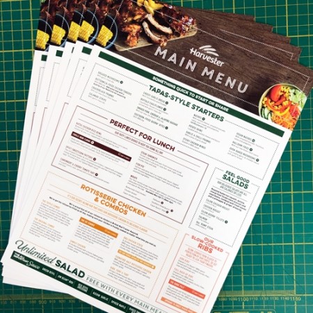
2.Divide your menu into easy to understand sections
A well designed menus is organised into sections in a sequential order.
Menu sections make it easy for customers to skim through and select what they want in a logical order, beginning with Starters and ending with Coffees and Desserts.
This simple design strategy results in an easy and efficient ordering experience for both your customer and your wait staff.
3. Resist the temptation to overload your menu
Too many options can be overwhelming and will not result in a satisfying experience for your customer.
Be selective and allow some empty ‘whitespace’. Choose your best new season dishes, sides and drinks and well-loved favourites and stick to them.
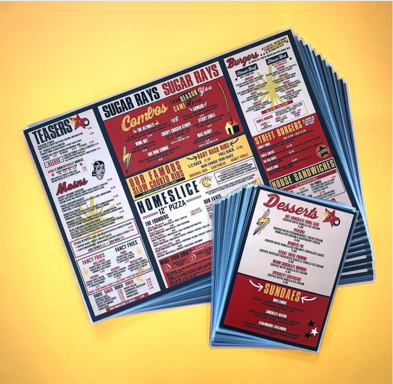
4. Use boxes to highlight best sellers
Boxes and shading are a simple yet effective way to group menu items together and draw attention the higher profit margin dishes that you want to sell more of.
5. Get creative with your menu descriptions
Hands down the top benefit of a well-planned menu is the experience of reading and imagining the dishes as you choose what to eat.
Studies show that well written listings boost sales by more than 30%, so make your words count. Get taste buds tingling by writing menu descriptions that are appealing and evocative.
Perhaps the heart of your restaurant is your locally sourced artisanal ingredients, your expert handcraft methods or farm to table experience. Consider how you want your customers to feel and what is important to communicate the value of your food. Then use phrasing to stimulate the senses and get your customers excited.
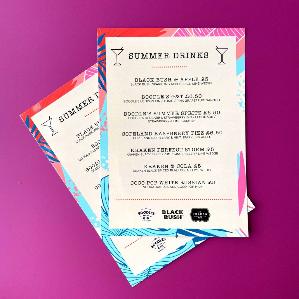
6. Leave off the currency signs
Pricing is often one of the more difficult elements to get right on a menu. However a good rule of thumb is to check out competitor pricing and find your own a balance between profit and affordability for your target audience.
When it comes to design, try to not make customers overly aware of how much they’re spending. Pricing should be clear but a good tip is to consider leaving off the Euro signs to effectively ‘soften the price’.
In fact, studies have shown that customers are more likely to spend more when currency signs are left off.
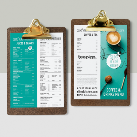
7. Don’t use photographs on your menu, unless…
Deciding whether or not to use photographs should depend on your restaurant brand.
High-end restaurants typically avoid photos entirely and opt to let their customer’s to imagination do the work. However mainstream restaurants find that high quality images used sparingly can effectively boost their sales.
If you do decide to use photographs, have them professionally taken. Food photography will not appeal to everyone and it may be safer to focus on crafting written descriptions instead.
7. Use graphics and illustrations to inject personality
An excellent alternative to photos is to use graphics and illustration to create visual interest.
Graphic embellishments work as ‘eye magnets’ and help to guide your customer through the menu, highlight key sections and are a great way to share your brand personality.
9. Choose a font that’s easy to read
It goes without saying that a good menu is easy to read. So while it is important to get your styling right it’s also vital that you consider the practical factors.
Is your space well lit or dim and cosy? Is your audience typically older or younger? What size is your menu and how many options can you visually accommodate without overwhelming your customer?
A simple tip is to remember that Serif and Sans Serif fonts are the easiest to read, while fancier speciality and script or brush fonts are ideal to highlight section titles and add design flair.
Use no more than 3 fonts to visually group information. For example: One font for menu, one font for descriptions and one for section titles.
Get creative with the styling but remember to pick a font that is easy to follow and brand consistent to create a positive experience for your customer.
10. Choose menu colours that mirror your branding
Choose menu colours that mirror your branding
It is well known that colour has a huge influence on the viewer and can help set the mood and theme of your restaurant. Make sure to align with your brand identity as much as possible and consider the following tips to get the most from your design.
- Is your restaurant casual or more formal? Energetic or calm, themed by cuisine? Think about what mood and tone you want to achieve and choose appropriate colours to mirror this in your menu design.
- Always keep a high contrast between your text and the background- light text on dark background or vice versa to make it easy to read under different lighting.
- Use colour to highlight certain features or items on your menu layout.
11. Choose the right menu size for your customer
Print your menu large enough for two people to hold and share or smaller for individual use. Your needs will depend on your style of dining, number of dishes and how often your menu changes throughout the season.
We’ve gone into more detail on this topic in our blog post Which restaurant menu size and layout is best?
12. Proofread, proofread and proofread again.
Mistakes happen often on menus, so ensure your hard work on isn’t lost on an embarrassing typo.
Before locking in your menu print order you must proofread thoroughly.
The best method for proofreading is to read it carefully from right to left and asking at least two other individuals to do the same.
13. How many restaurant menus should I print?
An insider tip to follow is to base your menu print number off your seating capacity.
For wine and drinks calculate 25% your restaurant seating capacity, for Lunch and Dinner roughly 75% and for Dessert roughly 50% your seating capacity.
We hope these 13 Restaurant Menu Design Strategies have got your menu ideas flowing!
If you need a little help creating a menu, our design team here at Kaizen Print is here to help your restaurant grow with a beautiful, affordable design. Reach out to us today to get started!